

Paver Color Design and Ideas
| Color is a powerful decorating tool that can visually expand or contract an area or add the impression of light, depth, warmth or coolness. Paver color selection is an important issue not to be overlooked in outdoor design because even what you would see as natural tones in paving or retaining walls can actually have a touch of yellow, pink, brown or stone, just as white can be dirty or warm or cool. Try to choose pavers with similar tones for a coordinated effect. | 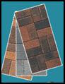 |
An easy way to recognize these paver tones is to place your brick or paver on a clean white surface. This brings out the subtle color which can often stay relatively hidden to an untrained eye until you see a large display of the object in question.
Light colors reflect the light and open up an area whereas darker tones absorb light and make areas appear smaller. When using large expanses of paler colored pavers or retaining wall blocks; break the vista with large scale plantings. Pale tones will visually lift a shady, darker area.
Knowing beforehand what effect you are striving for is also crucial in your selection of colors. Should the area to be paved blend in calmly to create a subdued appearance or do you want the area to appear more vivid to jazz up subdued surroundings? Ask your professional to provide you with color samples. Spread them out on your premises and "live" with those samples for a period of time to ensure you feel comfortable with them.
Latest Outdoor Paver Color Trends
Latest color trends are leaning towards lighter, natural and neutral colors, bringing to mind connotations of sand, shells and the holiday mode. Outdoor space needs to immediately say 'tranquility' and 'relaxation' and natural sandy tones certainly give you a head start!
Color Scheme Considerations
When deciding on your paver color scheme, consider:
|
 |
When choosing paver colors, select shades that harmonize with the area. If they are only a couple of shades lighter than the color of the house or building, they won't compete for attention. Gray pavers used with brick houses eliminate the urge many of us have to try to match everything. Use brick pavers with wood or stone houses to add warmth. Avoid monotony by combining two colors or use ones with a blended color.
The best advice is to remember that your instincts are probably right. Trusting your instincts might be at first challenging for you, but the easiest way to gain confidence in your instincts is to answer the following questions.
- How do the colors make you feel?
- Do you like them together?
- Are they the ones you want to live with now and in the future?
Nobody can answer those questions better than you can. What pleases your eye has the best chance of being right for your project.
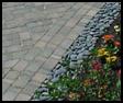
MONOTONE OR MULTICOLOR
| A monotone block is a block consisting of a single, uniform color. It may be red, it may be charcoal. The key factor is that it is one, single, pure color. A monotone is pure and sharp but shows even the slightest stain. An all-red pavement will look marvelous until it gets a single oil stain and then every time you look at the paving, your eye will zoom in on that one single solitary oil-stain, bird-dropping or tire mark. Monotone pavers can be used to provide contrast. They give definition, emphasize patterning and they fulfill a role within a larger color scheme. | 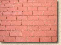 |
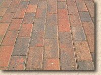 |
A multicolor is obviously a block with more than one color. It might be a blend of two, three or more colors. There may be varying amounts of each color within a single block or there may be roughly constant ratios of colors. A multicolored paver blends better with its surroundings. Most minor stains would be completely lost in the multitude of hues and tones. |
 |
Color mixes can consist of blends of up to four colors that harmonize well together and give a surface an interesting and lively appearance. In choosing a color, make sure that your installer and/or the sales rep of a manufacturer (whoever you prefer to deal with in this matter) shows you a wide selection of colors and provides you with several locations to view them installed. Seeing a color on a larger scale, in natural sunlight and shadows, surrounded by landscaping and in combination with colors on adjoining buildings, will give you the best impressions and serve as a good test to challenge or reinforce your instincts. |
CLASSIC DESIGN
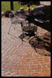
One of the most popular color schemes chosen for residential block paved driveways blends the best characteristics of both monotones and multi colors. A multi colored body with a mono toned soldier edging course. The multicolored paver gives depth and interest and richness while hiding the odd stain or two, and the monotone colored paver provides a frame, a solid definition – a win-win solution.
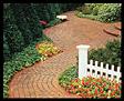 |
For ornate Victorian style houses, repeat the curves of the arched windows and doors by designing curved edges. For rectangular, colonial styles repeat the shape by using brick-shaped pavers. For brick homes, select pavers larger than the brick used in the home or use cobblestone. For buildings with simple, straight lines and little ornamentation, use pavers with interesting shapes and then install them in a simple geometric pattern. |
Make narrow spaces like paths and alleys appear wider by laying the pavers on a diagonal or in rows running across the area. Wide spaces can look narrower by running rectangular pavers the length of the area. Large expanses need interest. Let your imagination take over and create circles, curves and fan shaped patterns within the area. Avoid long straight rows. Not only are they difficult to keep straight during installation, they tire the eye of the viewer. When straight areas are necessary, lay the pavers parallel to the edge of the path and use a diagonal herringbone or a crisscrossed basket weave pattern.
PAVER TEXTURE
Changing the texture of the paver can also add interest. Smooth, rounded surfaces should be used where people are walking, playing or bicycling. Jagged, rough-textured surfaces can be used in areas of less traffic to create an accent or border. The patterns chosen will create the illusions necessary for the look you are trying to achieve.